FLOWiN
Design to shift littering habits through frictionless interaction.
Through field observations and user research across Sydney, me and my uni group identified a critical failure in the current waste management system: bins are frequently overflowing, difficult to locate, and perceived as unhygienic.
This friction, combined with high litter rates in public spaces has created an avoidance behavior where people would rather litter than interact with a bin.
We created FLOWIN to bridge this gap, reducing litter by transforming waste disposal into an engaging, interactive, and fun experience.
PROBLEM
CHALLENGE: PROBING A SENSITIVE TOPIC
When we started, finding the "why" behind littering felt like an unreachable target. I mean, would you admit to being the person who drops trash? Our initial interviews were hindered by Social Desirability Bias. We were met with defensive, surface-level responses like:
"I guess I’m just lazy."
"I do it because others do it too."
On the surface, these sound like fleeting feelings, but looking closer, I realized they revealed a deeper insight. User behavior was being dictated by individual friction and social norms.
As the lead interviewer, I decided to pivot. I stopped asking "Why?" and started asking "How?" I asked participants to walk me through the physical act of throwing something away, focusing on the small, everyday frustrations they encountered. Just like that, the conversation shifted from abstract opinions to barriers grounded in contextual reality:
While those insights were helpful, I was searching for something deeper, something emotional. Then, I heard it:
“I don’t want to touch it! It’s DIRTY.”
The pieces clicked. It wasn't just a lack of effort. It was an instinctual, human reaction to contamination. We realised that for many, bins are seen as dirty, smelly, overflowing objects to be avoided at all costs. This "Aha!" moment changed everything. We weren't just fixing design flaws.
We were fighting a negative bin perception and a fragmented urban layout.
"It's hard to find a bin!"
“ I don't want to lift the lid and the diagram is far too vague “
"I’m not bothered to go to the other side when I’m rushing."
POOR PLANNING
BAD BIN DESIGN
INCONVENIENT
3 INSIGHTS
Convenience is a critical factor that determines littering behaviour: improving bin coverage and waste diagrams can reduce the likelihood of a user littering.
Maintaining clean, odourless and contactless bins can significantly improve user perceoptions and their desrire to use them.
Acceptance of littering behaviour is determined by social norms; places with rubbish induce and rationalise acts of littering.
Bins in dense urban spaces fail to reduce litter and induces littering behaviour due to their inadequate coverage, lack of regular maintenance and ineffective diagrams.
The process of disposing of rubbish and using bins can be improved to be more enjoyable while providing easy access for individuals to locate and dispose of their waste.
01
02
Shifting Lenses from Too Technical (Bin Collector focus) => User-centric (Bin User focus)
At first we focused on Bin collectors, designing for urban layout and improving the cleanliness of bins. However, it was far too technical and limited to government infrastructure. I realised we couldn't design for the user experience. So, I opted for the group to focus on Bin Users, and sought to improve the rubbish disposal experience instead.
DESIGN PROBLEM STATEMENT
HOW WE CAME UP WITH OUR CONCEPT
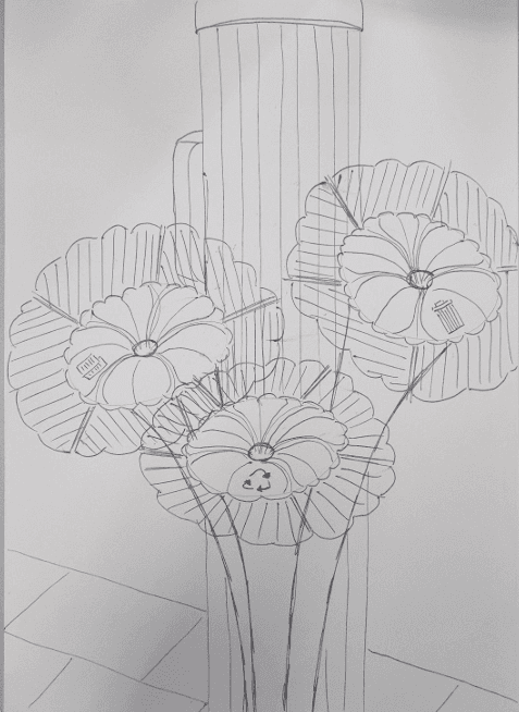
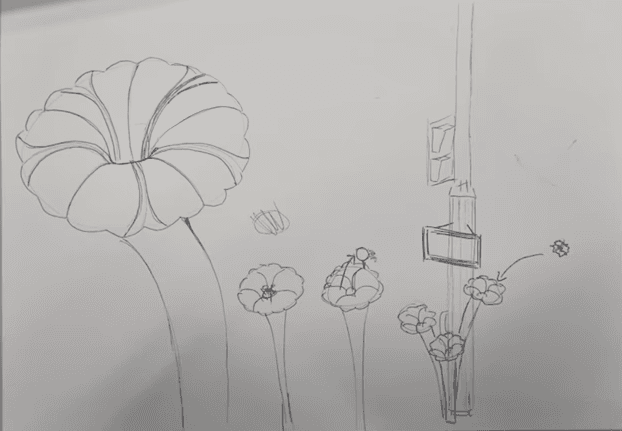
We ideated design solutions by storyboarding and selected a concept using the decision matrix. I put myself in the users' shoes and thought…
"It's a hassle to find a bin off-route, so why don't we have flower-looking bins installed at every traffic light intersection that runs by an underground pipe system? That way, users can easily find bins and won't have a reason to litter just because they're lazy, since they'll be waiting for the light to turn green anyway"
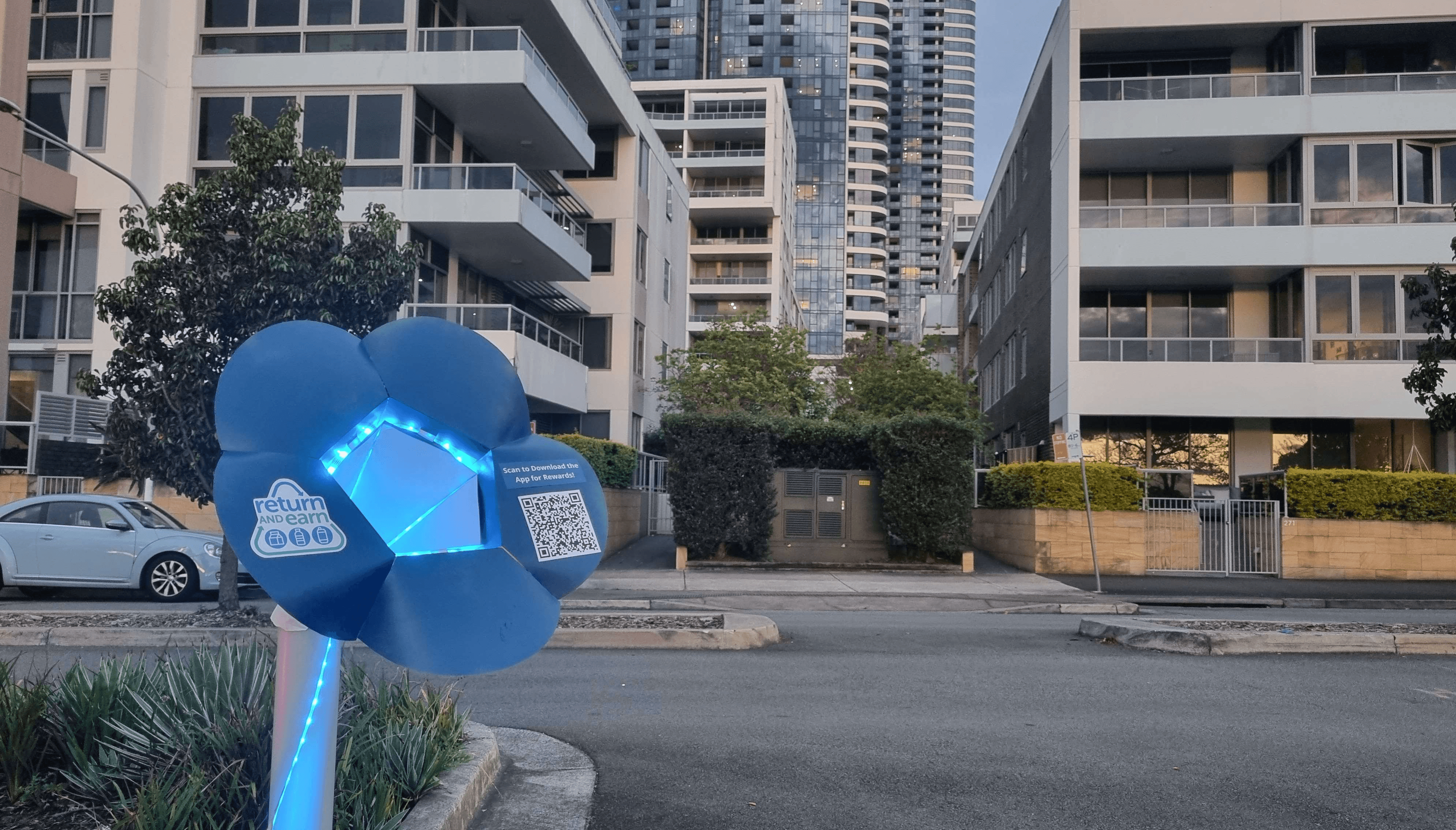
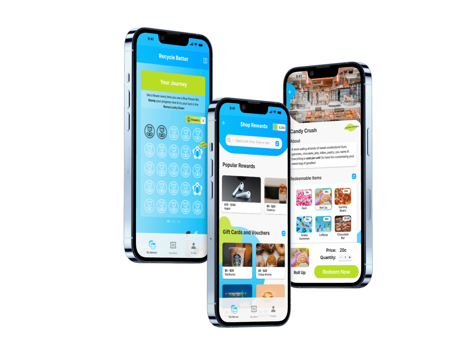
By prioritising user friendliness and convenience we chose my idea — the Flower Bin — as the base. Then, using a hybrid approach, we merged it with the strengths of other concepts. Our concept transformed into an integrated waste management Flower Bin System with a companion app.
SOLUTION
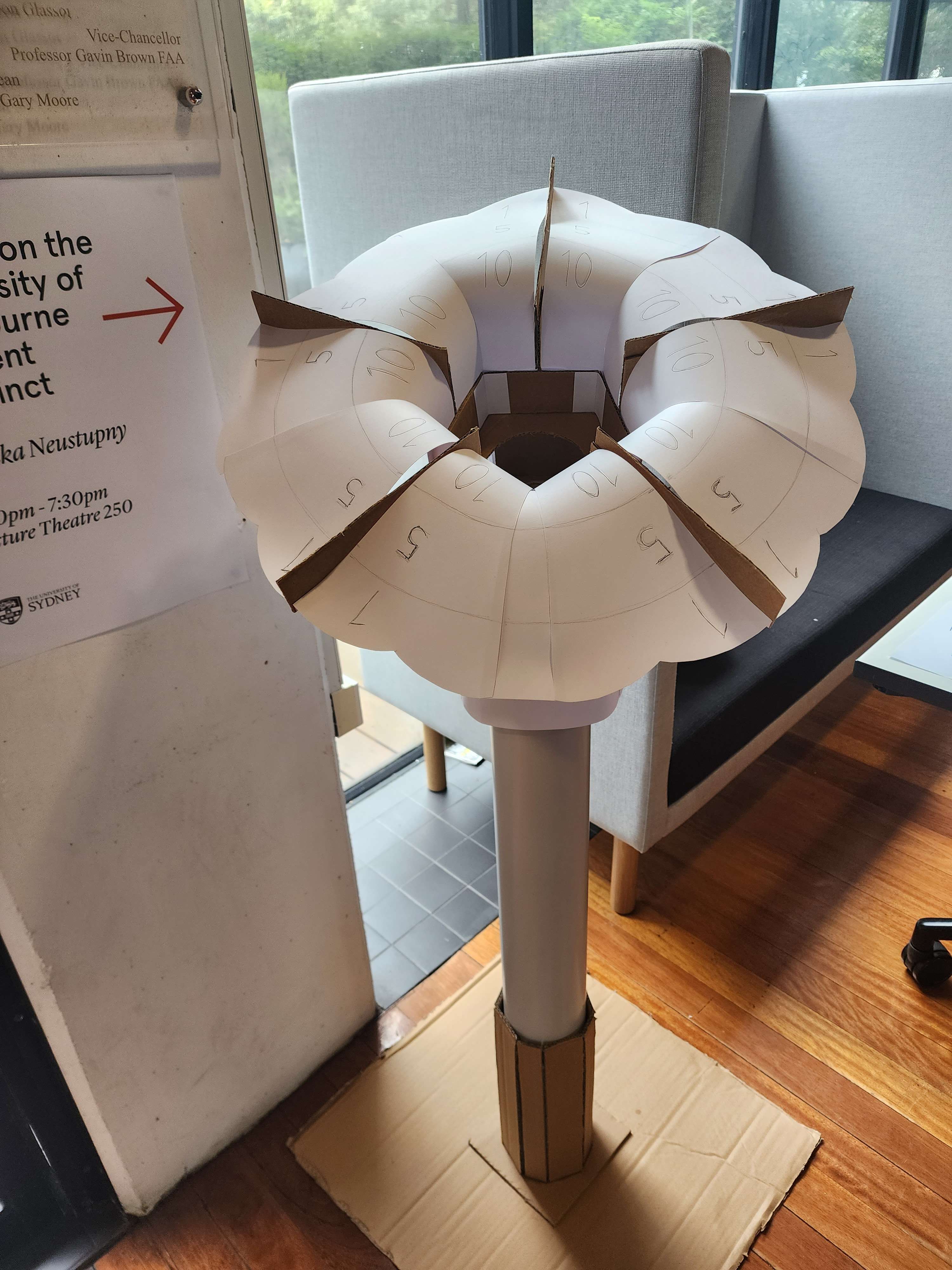
mid-fidelity
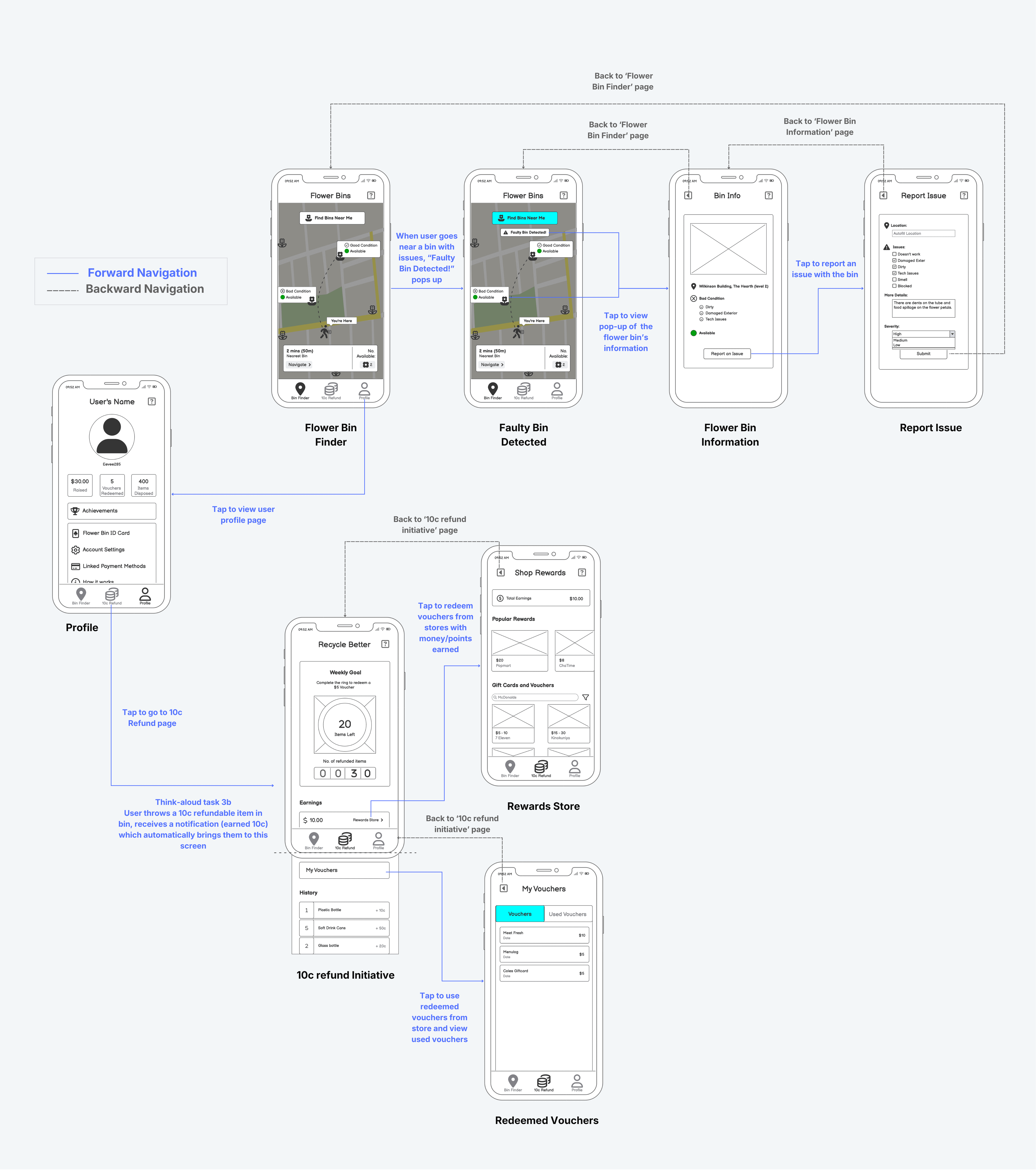
wireflow
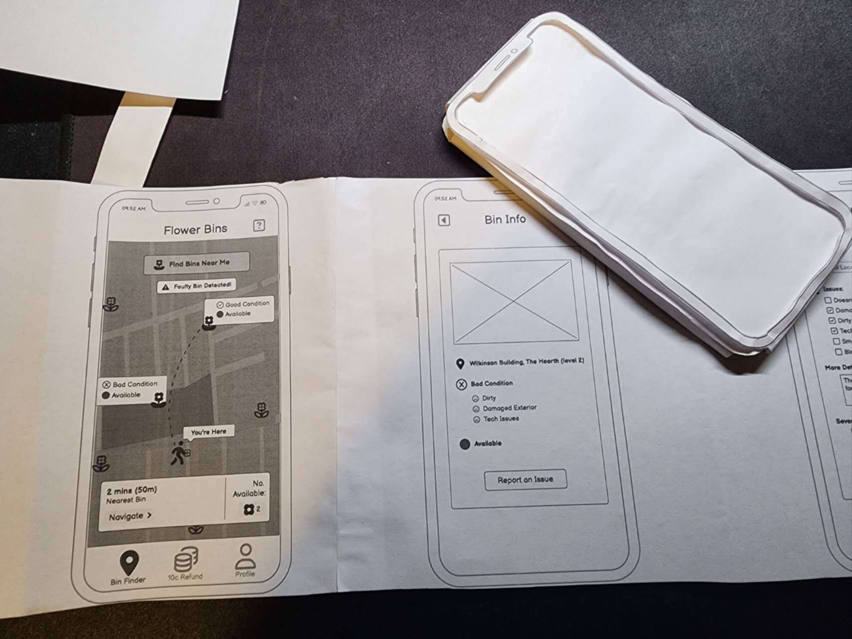
As team lead, I held a team brainstorming session for ideas on the main functions and features of our concept, then assigned roles based on our individual strengths. I focused on the app's digital architecture and wireframes, while supporting my teammates as they prototyped the physical flower bin.
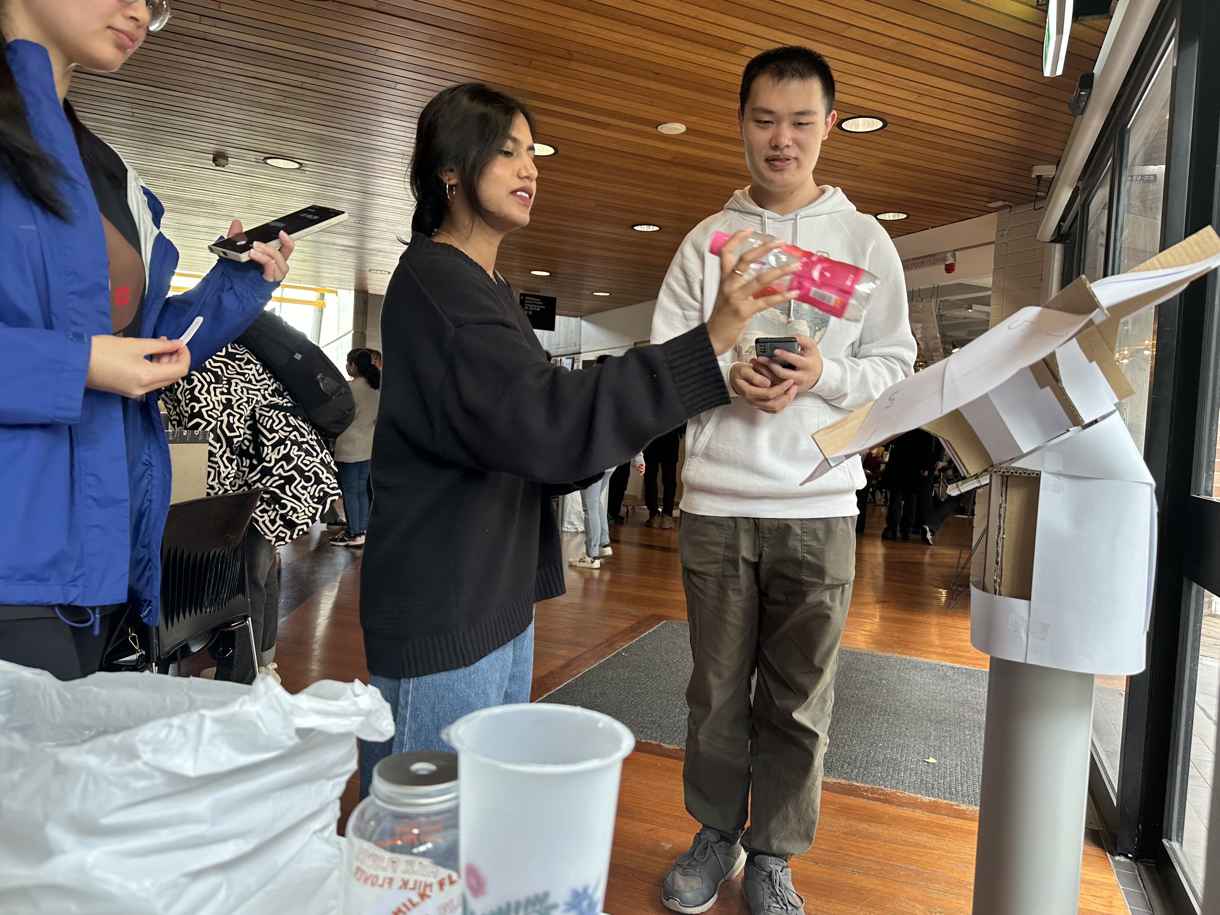
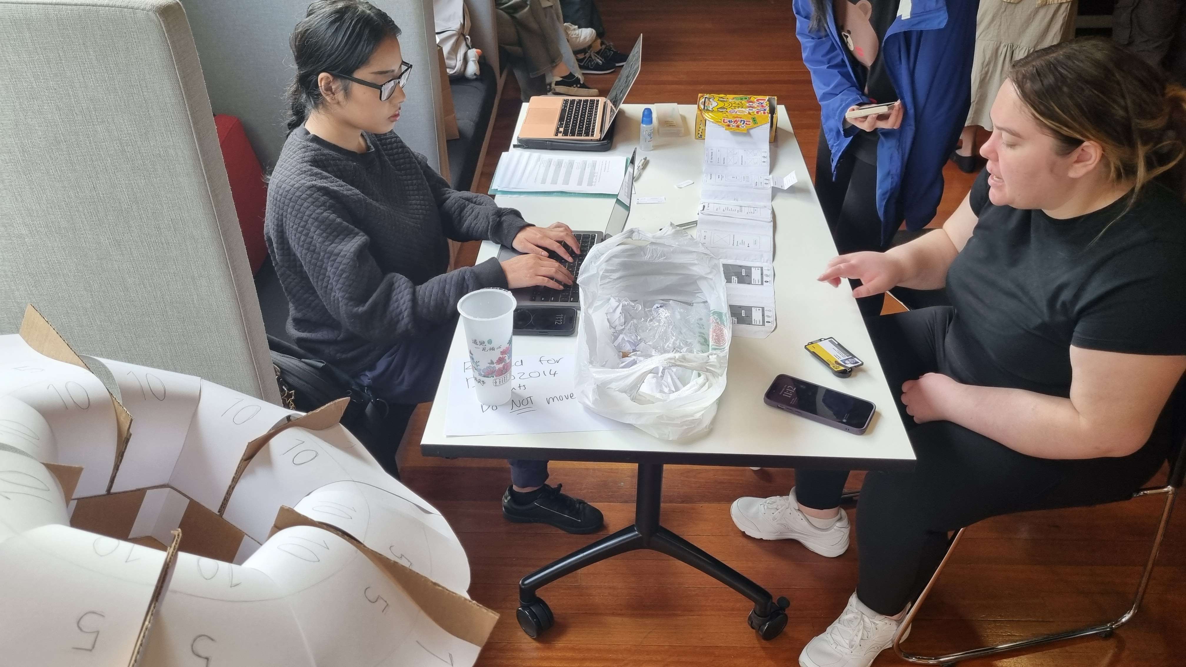
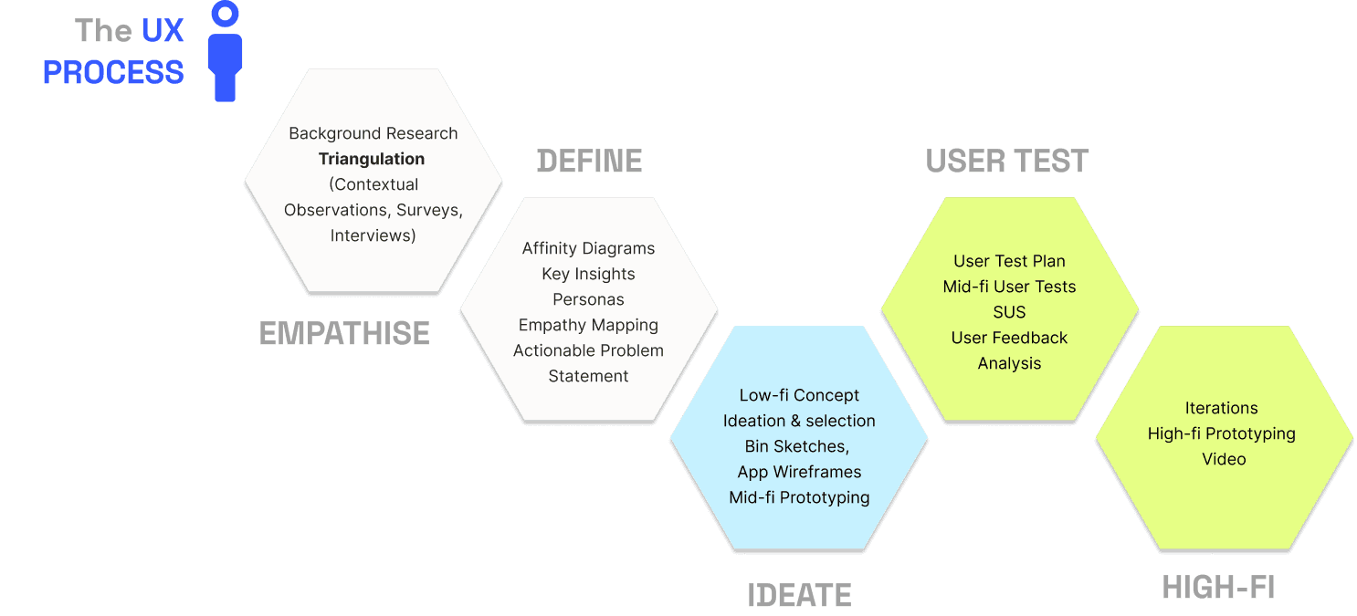
To validate our concept against public perception, we conducted Usability Testing with four participants using think-aloud protocols, interviews, and the System Usability Scale (SUS). Users loved the Flower Bin aesthetic, describing it as a friendly reminder to be "mindful of the planet". They also valued the integrated pipe system and the inclusion of a 10 refund incentive.
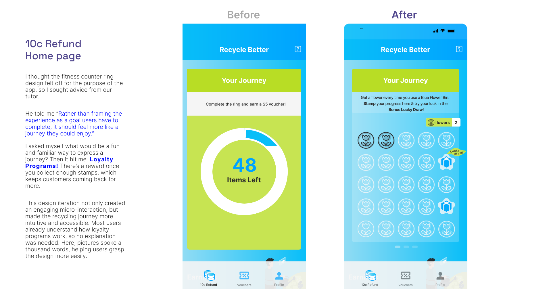
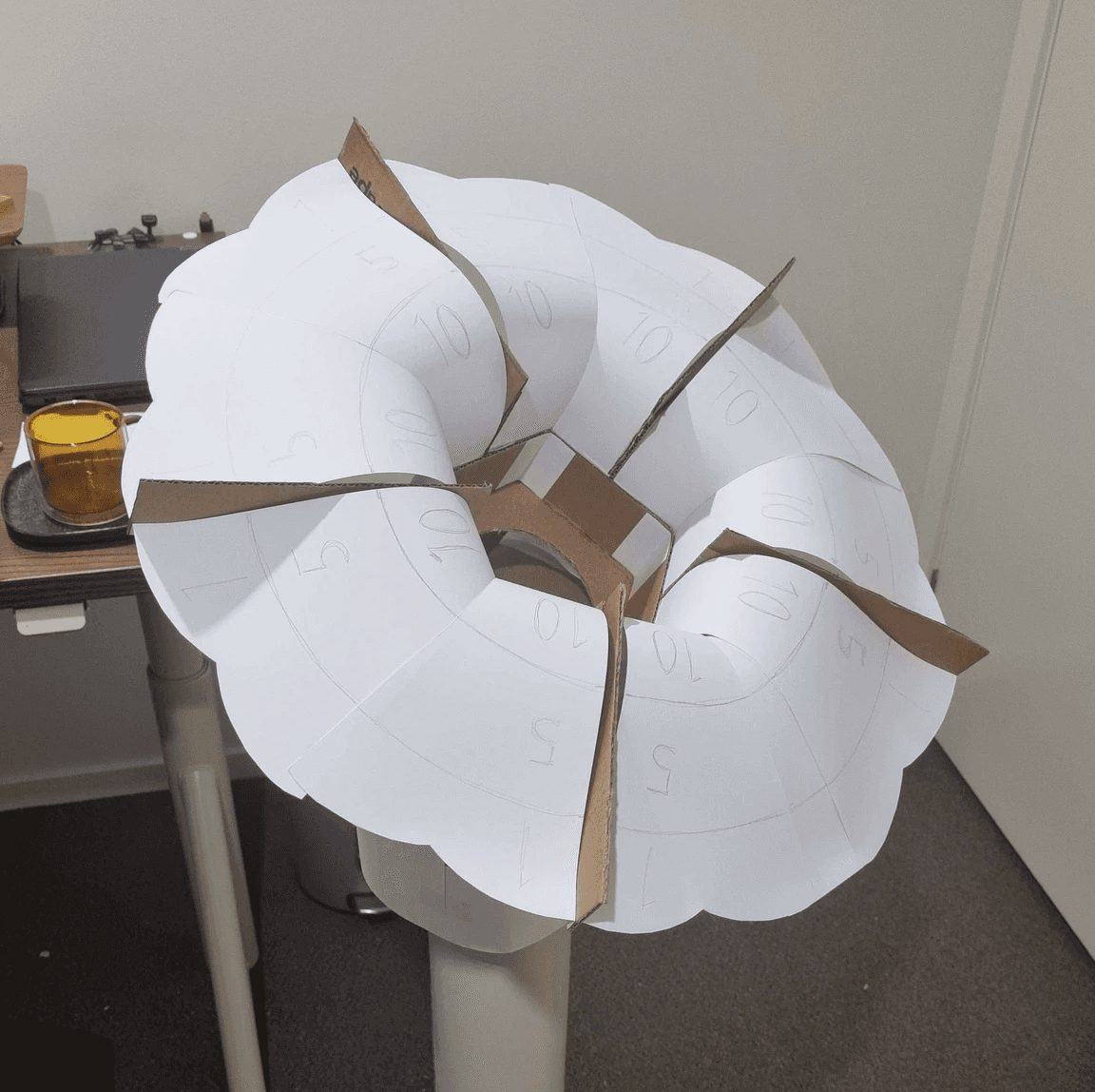
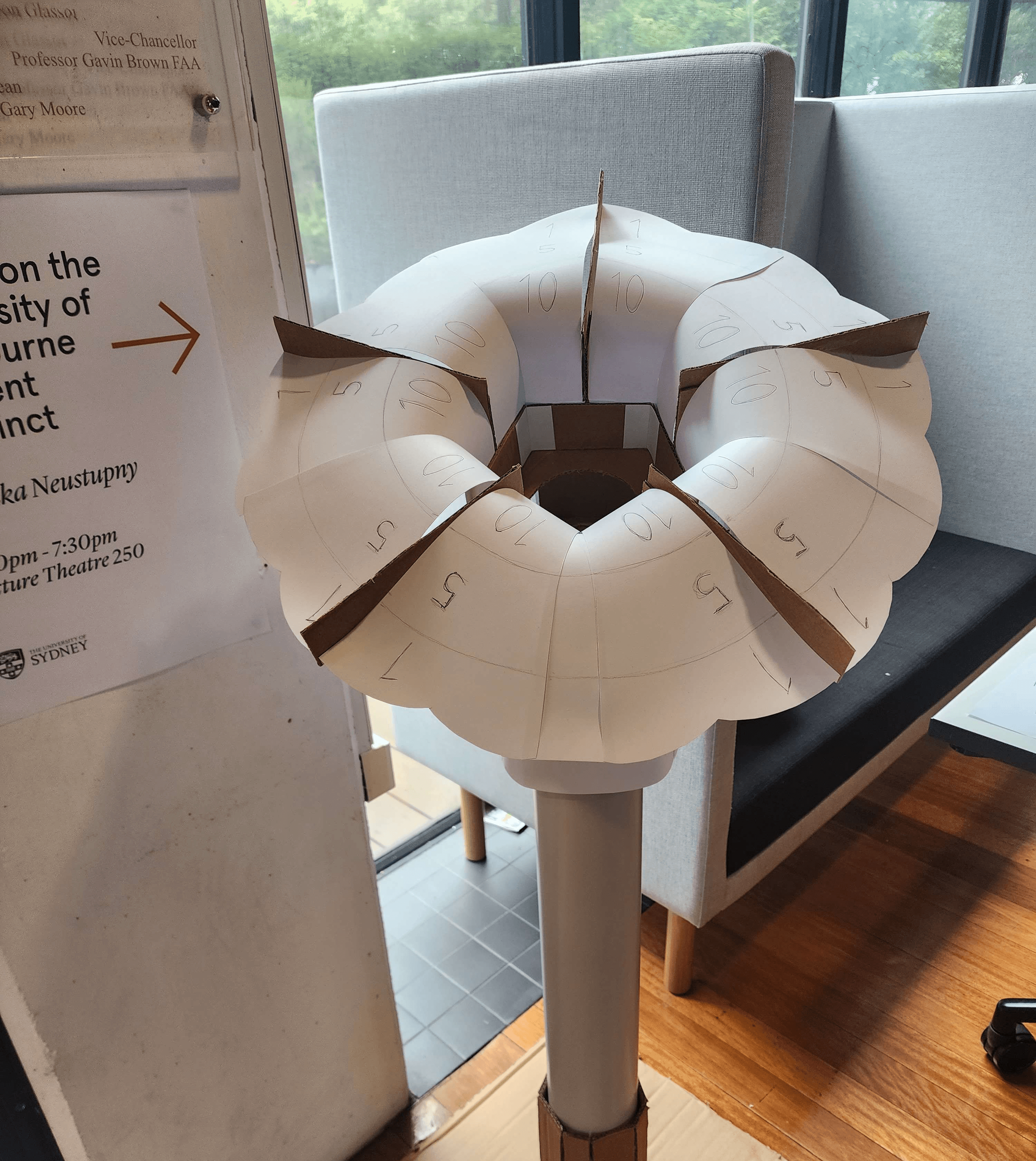
However, the sessions revealed key areas for improvement. Users were initially confused by app discovery and the purpose of the numbered petals, alongside some minor UI friction."
01
02
03
These insights allowed us to refine the cohesiveness of the system and polish the user flow in our final iteration.
Numbered petals confusing
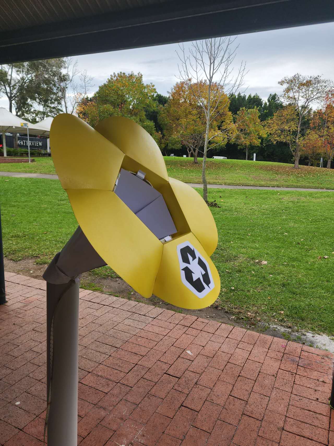
No bin signage provided
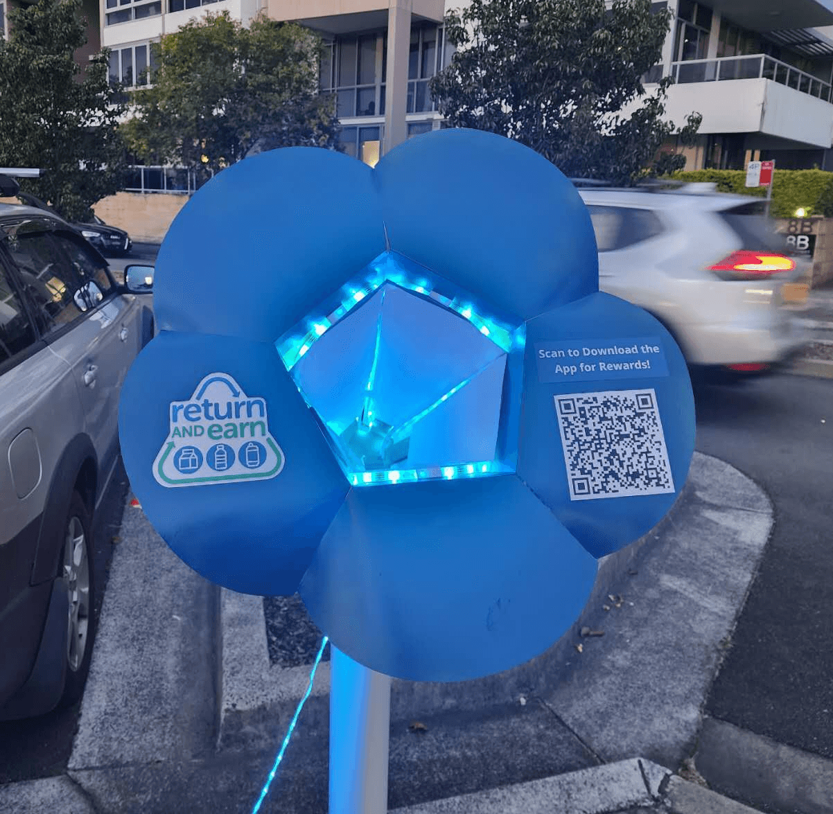
No way to discover the app
user- testing
iterations
Before
After
Added QR code for App Download
Removed numbered petals
Added bin symbols like recycling sign
01
02
03